

Genesis USA Competitor Compare
Role
-
Lead UX Designer
-
UX Researcher
Team
-
UX Designer
-
Visual Designer
-
Content Designer (Copy)
-
Project Manager
-
Dev Team
Duration
-
3 months
Duties
-
Competitive Analysis
-
Heuristic Analysis
-
User Research
-
Concept Ideation
-
UI Design
-
Prototyping
Product Overview
I was tasked with revamping the Genesis USA website and its suite of digital tools. This comparison tool, powered by JD Power data, allows users to evaluate Genesis vehicles against competitors while showcasing Genesis’s strengths. Our team led the user experience and visual design, while JD Power managed the underlying data.

Problem Statement
How might we craft a distinctive, branded experience that engages users while preserving data accuracy and consistency? The goal is to empower users to explore and control the information they view while driving confidence, transparency, and deeper connection with the Genesis brand.
Goals
Create an interactive platform that not only highlights the Genesis brand in distinctive and memorable ways but also enhances user engagement throughout the browsing experience. The tool should invite exploration, build brand affinity, and seamlessly guide users toward purchase consideration. By combining dynamic interactions, intuitive navigation, and data-driven insights, the experience aims to both elevate brand perception and increase overall user conversion.
Design Process

Define
-
Project Timeline
-
Competitor Analysis
-
User Persona
-
User Interview

Ideate
-
User Flow
-
Information Architecture
-
Style Guide

Design
-
Wireframe
-
HiFi Designs
-
Digital Prototype

Test
-
Feedback
-
Conclusions
-
Future Concepts
Unlike traditional luxury brands that primarily attract a middle-aged or older demographic, Genesis is positioning itself to engage a younger, more dynamic audience. The brand aims to connect with users in their 20s and 30s who value innovation, design, and technology as much as performance. Through influencer partnerships and social campaigns, Genesis is building awareness among a new generation of drivers and those seeking a modern expression of luxury that feels bold, aspirational, and authentic.
Target Audience

User Persona
Irene

Age
Job
24
Influencer
Status
Single
Location
Kids
LA,CA
-
Irene has a large following on her socials making her a top contributor. She is in the market for a new luxury vehicle but wants quality over anything. She has limited knowledge of cars but is pretty tech savvy.
Goals
Frustrations
To get the bells and whistles at a reasonable price
Something fast and sporty
When comparing it all appears like a spreadsheet
I want to see visual differences and facts
Brad

Age
Job
32
Developer
Status
Married
Location
Kids
SEA,WA
2
Brad is a young family man that is quickly rising in the cooperate world. He seeks a new car with his new promotion that looks good and will fit his family comfortably.
Goals
Frustrations
Needs to fit his family of 4
Wants to have top tech availability
Unable to get a detailed comparison and view vehicles side by side
Websites being nontransparent
User Research
Although this project didn’t include a dedicated researcher, I recognized that strong design begins with strong insights. Taking initiative, I led the research efforts to ensure the final product was grounded in real user needs. I conducted on-site interviews with customers at a local dealership, performed a competitive analysis, and explored key behavioral patterns across the category. These efforts uncovered critical pain points and opportunities that directly informed our design strategy—helping shape a more intuitive, user-centered solution that truly resonates with the Genesis audience.
Competitive Analysis
🚗 Key Findings
💡 Market Gap
Most automotive brands lack a true comparison tool — a missed opportunity that Genesis can capitalize on to stand apart.
🌐 Cross-Industry Perspective
Exploring other industries (motorcycles, furniture) revealed similar gaps in how data is displayed and explored.
🖱️ Low User Interaction
Existing tools offered limited control or customization, resulting in low engagement and passive browsing.
🚀 Opportunity for Differentiation
By creating a dynamic, user-empowered experience, Genesis can redefine how customers compare vehicles and strengthen brand perception.

User Interviews
👥 User Insights
🧭 Exploration First
Most users view the website as an initial point of discovery rather than a place to make direct purchases.
⚙️ Trust Gap
There is noticeable hesitation and mistrust toward completing major transactions online—especially within the luxury automotive space.
💬 Human Connection Matters
When informed that the online experience serves as a personalized concierge service—initiating contact with a real representative—users expressed renewed excitement and confidence.
🚗 Opportunity for Hybrid Experience
Blending digital convenience with human interaction can build trust, elevate the brand’s luxury perception, and encourage users to take the next step in their purchase journey.
Pain Points
01
Key navigation pathways lack visibility, increasing cognitive load and reducing discoverability.
02
An overly rigid grid constrains visual hierarchy, limiting engagement and scannability.
03
Interaction patterns rely heavily on accordions, resulting in low engagement and shallow user feedback.
Sketches
Sketching allows me to quickly explore and iterate on ideas early in the process. It’s a fast, low-fidelity way to visualize concepts, gather stakeholder feedback, and validate direction before moving into detailed design execution. Below are a few initial sketches from this project.


LoFi Wires
Transitioning from sketches to low-fidelity wireframes brings ideas into a digital form where structure, flow, and functionality can be rapidly tested and refined. This phase enables quick iteration and feedback before investing in high-fidelity visuals.

Iteration 1
��
Research identified uncertainty at the entry point, with users unsure where to start or which Genesis model best fit their needs. I redesigned the selection flow into a clear, guided progression, vehicle selection followed by powertrain and package exploration, reducing cognitive load, increasing confidence, and improving early engagement.
Iteration 2
This iteration prioritized personalization and engagement by improving vehicle color selection, a key driver of emotional connection and purchase confidence. I refined interaction patterns for clarity and introduced logic to surface in-stock vehicles aligned with user preferences, bridging exploration to action and supporting qualified lead and inventory-based conversion goals.


Iteration 3
In this iteration, I centered the vehicle as the primary focal point and enabled a full 360° interactive view to give users greater control and context. This approach increased immersion and product understanding, reduced uncertainty during comparison, and helped users make more confident decisions throughout the experience.
Iteration 4
In this iteration, I emphasized the Genesis brand across the experience to ensure the tool functioned not only as a comparison platform, but also as a persuasive sales touchpoint. Each interaction was intentionally designed to highlight Genesis’s value proposition, guiding users from initial curiosity toward confident purchase consideration.

HiFi Wires
High-fidelity wire-frames bring together the foundational layout and visual design. This stage was informed by multiple alignment sessions with stakeholders to ensure clarity, feasibility, and shared direction. The experience was designed with equal emphasis on functional rigor and visual polish across both mobile and desktop platforms.

For the header we broke down the vehicle type for quick selection. When type is selected then the models will appear in a carousel for the user to view and rotate then select.

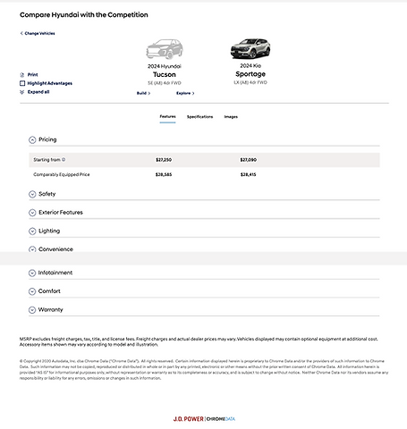
For section 2 we start to dive into the comparison breakdown. We created this where in column one will be the Genesis model and column two will be the closest luxury competitor giving Genesis control who that will be, while column three will be open for the user to select if they wanted to compare a third. All columns are changeable with different brands and models.

In section 3 was the data of the vehicle comparison. It is an accordion structure where the user can filter by viewing all the data or highlight info of where Genesis is better. After some of the research it was discovered keeping the accordions closed was okay but we needed to have the first one open and prioritized to not only share the info but to give users visual direction.

Section 4 is where we show the different images of the exterior and interior. What I wanted to accomplish here was matching the color selection chosen from section 1. I also wanted to show in the competitor what there closest matching color was too.

Finally in the final section is the poster card of the model with the quick data points, the vehicle color would continue to be carried in this section as well. Finally the CTAs to complete the funnel to purchase.

Impact
-
Visits increased by 19%
-
Bounce rates decreased by 14%
-
Conversion rates to sales increased by 7%
Key Takeaways
Going the extra distance to do your own research and show the clients your findings helps to support your direction. When the budget doesn't allow for dedicated research be crafty and get your findings, without data the design will be flawed.