
.jpeg)
CVS
Minute Clinic
Role
-
Lead Product Designer
-
UX Researcher
Team
-
UX Designer
-
Visual Designer
-
Content Designer (Copy)
-
Project Manager
Duration
-
3 months
Duties
-
Competitive Analysis
-
Heuristic Analysis
-
User Research
-
Concept Ideation
-
UI Design
-
Prototyping
Product Overview
The CVS Health team wanted to reimagine the MinuteClinic website to better communicate the range of services offered to users. The experience needed to feel functional, approachable, and visually engaging while maintaining a mobile first strategy, as the majority of users accessed the platform through mobile devices.
Problem Statement
The existing perception of MinuteClinic was largely centered around flu shots and vaccinations. The redesign aimed to reposition the experience by highlighting the quality of care provided by medical professionals, increasing awareness of the broader range of healthcare services available, and streamlining the appointment scheduling experience to make care more accessible and intuitive for users.
Goals
The goal was to better educate users on what MinuteClinic offers and reinforce that it can support a wide range of everyday healthcare needs. The experience prioritized clarity, accessibility, and ease of use, ensuring components were intuitive and approachable for a diverse user audience.
Before
After
Design Process

Define
-
Project Timeline
-
Competitor Analysis
-
User Persona
-
User Interview

Ideate
-
User Flow
-
Information Architecture
-
Style Guide

Design
-
Wireframe
-
HiFi Designs
-
Digital Prototype

Test
-
Feedback
-
Conclusions
-
Future Concepts
The target audience for MinuteClinic primarily includes users seeking fast, convenient, and accessible healthcare solutions. This often includes busy professionals, students, and working parents who need efficient care that fits into their daily routines.
While convenience driven users represented a core audience, it was also important to recognize and design for the large senior population that regularly utilizes MinuteClinic services. This required creating an experience that balanced speed and simplicity with accessibility, clarity, and ease of navigation for a diverse range of users.
Target Audience

User Persona
Will

Age
Job
21
Student
Status
Single
Location
Kids
NYC, NY
-
Will is a busy college student in his senior year. He usually stays pretty active in sports and the gym but is always on the go.
Goals
Frustrations
Stay Healthy and graduate in the spring
Get tested regularly for STDs
Booking at the physician takes to much time to set an appointment
He can only see his primary doctor at one location on the other side of town
Jen

Age
28
Job
Teacher
Status
Married
Location
Kids
KC,MO
1
Jen is a new mother and about to go back to work after parental leave. Between work, the new born, and taking care of her mother time is limited.
Goals
Frustrations
One place to see her family quickly
Flexible times for appointments
Dr offices are usually only available during the work day
Call and immediately get put on hold
User Research
While this project did not include a dedicated researcher, I viewed research as a critical part of creating an effective user experience and took ownership of the process to ensure the product was grounded in real user needs.
I conducted interviews with individuals who aligned with the target audience, completed competitive analysis across healthcare and appointment based platforms, and explored additional research methods to better understand user behaviors and expectations. Through this process, I identified key pain points and opportunities that directly informed the design strategy and helped shape a more intuitive, accessible, and user centered solution for MinuteClinic.
User Flow
Mapping the existing user flow helped us better understand how users were entering the experience and the pathways available to complete their goals. While it was important to provide users with flexibility and choice, it was equally critical to avoid overwhelming them with unnecessary complexity.
By analyzing the current flow, we were able to identify friction points, navigation challenges, and areas where users were experiencing confusion or drop off. These insights helped inform a more streamlined and intuitive experience for MinuteClinic, with a stronger focus on clarity, accessibility, and efficient task completion.

User Interviews
Through user interviews, I uncovered several key insights that helped shape the direction of the redesign. One of the most common findings was that many users did not fully understand what MinuteClinic was or the range of services it provided. Most participants primarily associated the experience with vaccinations and flu shots, limiting awareness of its broader healthcare offerings.
Users also expressed confusion with the existing site navigation and appointment scheduling flow. The scheduling experience lacked clarity and felt unintuitive, while much of the supporting page content was viewed as uninformative or difficult to scan. These findings reinforced the need for a clearer information hierarchy, simplified navigation, and more educational content throughout the experience.
Pain Points

01
Navigation and scheduling
Users experienced confusion when navigating the site and completing the appointment scheduling process. Key actions were not always intuitive, creating friction throughout the experience.
02
Information Accessibility
Important healthcare information and guidance were not presented clearly or prominently. As a result, users often turned to external resources such as WebMD to find answers instead of relying on the platform itself.
03
Service Awareness
Many users were unclear about the full range of services offered by MinuteClinic, often assuming it was limited to vaccinations and basic treatments.
Competitive Analysis
Through competitive analysis, I explored how other healthcare and clinic based platforms positioned their services and communicated value to users. One of the strongest patterns across competitors was the consistent use of “Reasons to Believe” messaging, reinforcing trust, credibility, and quality of care. It became clear that even established healthcare brands still needed to actively build user confidence throughout the experience.
Another common pattern was the prominence of the scheduling experience. Across nearly every platform, appointment booking was positioned front and center, emphasizing speed and convenience as a primary user need.
This research helped identify two core user types for MinuteClinic:
-
Users who were already familiar with the brand and simply wanted to quickly schedule the next available appointment
-
Users who were less familiar with the service and needed time to explore, understand available offerings, and build trust before booking care

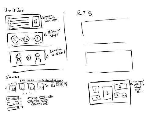
Sketches
Sketching is an important part of my early design process, allowing me to quickly explore ideas, iterate on concepts, and evaluate potential directions before moving into higher fidelity work. It is often much faster and more effective to sketch ideas first rather than immediately building them digitally. This also creates opportunities for rapid stakeholder feedback, helping identify promising concepts early so they can be refined and pushed further into development.
The sketches for this project focused on exploring a variety of components and content structures, including how services were presented, how the experience explained the process to users, and how the overall page hierarchy could be organized. These explorations helped establish the foundational structure and interaction patterns for the redesigned MinuteClinic experience.

LoFi Wires
Low fidelity wireframes were the next step in evolving ideas from initial sketches into a more structured digital experience. Moving concepts into a digital format allowed for faster iteration, clearer communication, and a deeper exploration of layout, functionality, and user interaction patterns.
At this stage, the focus was less on visual polish and more on establishing usability, information hierarchy, and overall flow. Through continuous iteration, the wireframes helped validate how components would function together and how users would navigate the redesigned MinuteClinic experience.
Round 1
During the first round of exploration, the primary focus was defining the overall structure and hierarchy of the page experience. This phase combined existing design patterns and components with new conceptual ideas to evaluate how the experience could better communicate services, build trust, and support appointment scheduling.
The goal was to quickly test multiple directions while establishing a foundation for layout, content organization, and interaction flow within the redesigned MinuteClinic experience.

Round 2
By the second round of exploration, the overall page structure and experience direction had become more clearly defined. The focus shifted toward refining how information was presented and how users would consume content throughout the experience.
This phase explored multiple levels of execution, including a minimum viable product (MVP), a more aspirational north star vision, and concepts that balanced innovation with realistic implementation constraints. Evaluating these variations helped align user needs, business goals, and technical feasibility within the redesigned MinuteClinic experience.


Round 3
In the third round of exploration, the focus shifted toward introducing stronger visual refinement and brand expression into the experience. Working closely with CVS Health, we began incorporating elements from existing campaigns, iconography systems, and established visual language to create a more cohesive and recognizable experience.
This phase helped bridge the gap between structural UX exploration and polished interface design, ensuring the redesigned MinuteClinic experience felt both approachable and aligned with the broader CVS brand ecosystem.

Round 4
In the fourth round, the experience evolved based on stakeholder feedback and continued usability refinement. Several components were simplified to improve clarity and reduce cognitive load, including restructuring service categories into more digestible pill based interactions. Greater emphasis was also placed on showcasing healthcare providers through a dedicated carousel component to help build trust and create a more human centered experience.
One of the most significant updates was the evolution of the scheduling experience. The concept leaned further into a technology forward approach by incorporating geolocation capabilities to help users more easily find nearby clinics and simplify the appointment booking process. This created a faster, more personalized scheduling experience within the redesigned MinuteClinic platform.

Round 5
In the final round, I was tasked with presenting two distinct directions: an MVP solution that could be integrated immediately using existing systems and components, and a more aspirational north star vision focused on long term innovation and future scalability.
The MVP approach emphasized realistic implementation, leveraging current capabilities to improve usability, clarity, and scheduling efficiency in the short term. In parallel, the north star concept explored new component patterns, enhanced personalization opportunities, and more forward thinking interaction models that could be introduced incrementally over time.
This approach helped balance immediate business needs with a long term product vision for the redesigned MinuteClinic experience.
MVP

North Star
HiFi Wires
High fidelity wireframes brought together the established layout foundation with the refined visual design direction developed throughout the iterative process. These designs were created following multiple alignment sessions with stakeholders to ensure the experience balanced user needs, business goals, and brand expectations.
In today’s digital landscape, it is equally important to create experiences that are both highly functional and visually engaging across mobile and desktop platforms. With a strong mobile first approach, the high fidelity designs explored the north star vision for the redesigned MinuteClinic experience while maintaining scalability and usability across devices.

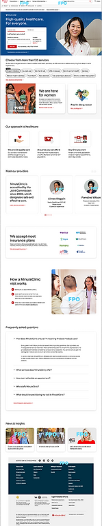
In section 1 I'm focusing on the brand and the scheduling tool. I want the user to feel welcomed with CVS and they know it. We offered 2 types of visits and utilized geolocating to give them the closest location.

Section 2 was to highlight the amount of services they offer (135). Grouping them and marking them in these pills components. When a user clicks it will take them to that particular information page. Next was to highlight the campaigns that CVS is invested in.

Section 3 I prioritized the reasons to believe. It was important to keep the message simple and directs collaborating closely with Copy we were able to make a succinct message that reviewed well with customers.

Section 4 we want to give faces to to the clinic. Bringing forward the professional staff helps to humanize the clinic.

Section 5 when interviewing the customers one of the common concerns was insurance. It was important to bring that forward, I wanted to highlight some of the top brands for quick recognition then provide a link for further investigation.

Section 6 it was a neccesity to simplify how this process works. Given the wide range of customers I didn't want to complicate and lose anyone. So in 3 steps we tell them to schedule, check and respond to an email, then afterwards personalize there dashboard.

Section 7 CVS has success with there FAQ section already. So through a prioritization exercise it was established this would be a good place.

Section 8 what isn't common knowledge is CVS in depth database of articles and information for customers to have access to. I thought this was valuable when thinking about the users common approach was WebMD. If we could bring that information forward then they could build more trust between the brand and the customer.
Impact
-
Improved accessibility enhancements, including larger touch targets and screen reader optimization, helped create a more seamless and inclusive experience for users with varying accessibility needs.
-
A more intuitive navigation and appointment scheduling experience reduced user friction throughout the journey, contributing to a 30% faster scheduling process and improved overall customer satisfaction within the MinuteClinic platform.
Key Takeaways
The redesign of the MinuteClinic experience focused on improving accessibility, efficiency, and user trust to help patients more easily find, understand, and schedule the care they need. By streamlining navigation, optimizing the experience with a mobile first approach, and enhancing accessibility standards, the redesign reduced friction throughout the user journey and created a more intuitive healthcare experience.
Additional improvements, including clearer service descriptions, transparent pricing, and integrated patient trust signals, helped strengthen user confidence and support higher appointment conversion opportunities. Personalized content strategies and proactive healthcare reminders also introduced opportunities for stronger long term engagement and retention.
Collectively, these enhancements elevated both the patient experience and the overall business impact by increasing engagement, reducing user drop off, and improving operational efficiency.
Next Steps
Monitor Performance and Gather Insights
-
Track key experience metrics such as appointment conversion rates, bounce rates, and mobile engagement to evaluate the effectiveness of the redesign.
-
Implement A/B testing across critical touchpoints, including the homepage and scheduling flow, to further refine and optimize the user experience.
-
Continue gathering direct user feedback through surveys, analytics, and usability testing to identify remaining friction points and future improvement opportunities.
Enhance Personalization and Engagement
-
Introduce personalized appointment recommendations based on user behavior, history, and healthcare preferences.
-
Expand proactive health reminders and follow up care suggestions to encourage stronger long term patient engagement and retention.
-
Explore AI driven chat support and triage experiences to provide faster assistance, answer common questions, and guide users toward appropriate care options.
Optimize Operational Efficiency
-
Automate appointment confirmations, reminders, and follow up communications to help reduce no show rates.
-
Improve backend analytics and operational tooling to better support clinic staff with demand management and resource allocation.
-
Continue strengthening security, accessibility, and data privacy measures to maintain compliance and reinforce user trust within the MinuteClinic experience.